HOBNOB

CLIENT | Berlin Communications
SERVICE | branding + DESIGN
YEAR | 2020
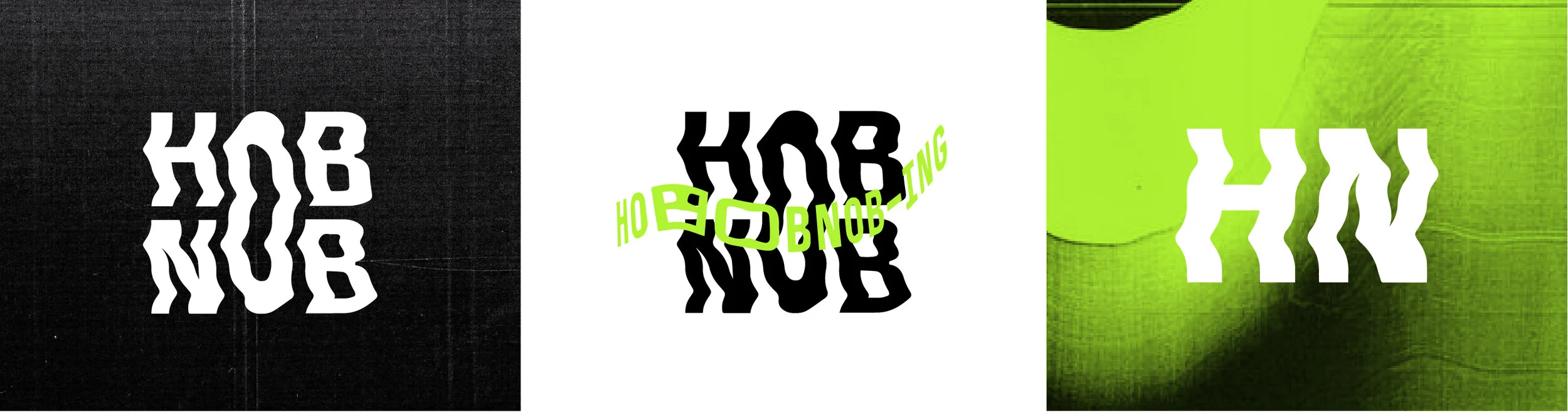
Hobnob, in the early 19th century, is defined as: "from archaic hob or nob, hob and nob, meaning 'give and take', used by two people drinking to each others' health. Hobnob is a side project created by myself and Hilary Zak for Berlin Communications to create a webinar of sorts utilizing Instagram live. In this time of social distancing and isolation, it was felt that by having a channel that facilitates and encourages dialogue between individuals in the Edmonton community, a space would be created in which people can share their experiences. Individuals who will be a part of the Hobnob discussion are those who have shown resilience, ingenuity, and who continue to make a difference in the lives of others. In other words, and the catch-phrase for the Hobnob series, those who ‘risk it for the biscuit’. The tone of our visuals and branding were going for a punk/grunge/distortion vibe, and having the logo mark on its own be able to achieve that, but also layering in how photos are treated, as well as typography in the more visual sense.