EDMONTON SCREEN INDUSTRIES OFFICE

CLIENT | Edmonton screen industries office
service | branding + design
year | 2020
AWARDS | 2021 ACE AWARD - Not-for-Profit Logo + 2021 ACE DISTINCTION AWARD - Not-for-Profit identity system
A branding project I worked on while at Berlin Communications, for the client ESIO, who was looking for a logo that could help them share their story in a clear and compelling way. For this client ‘screens’ are everything, and I was tasked with creating something that could represent not only the tv/film side of screens but also the video game/augmented reality etc. side of screens. Screens are our window on different worlds, different perspectives, new ideas. Whether we watch them, play on them or use them to augment our reality, they have one thing in common: they immerse us in whatever a content creator can imagine.
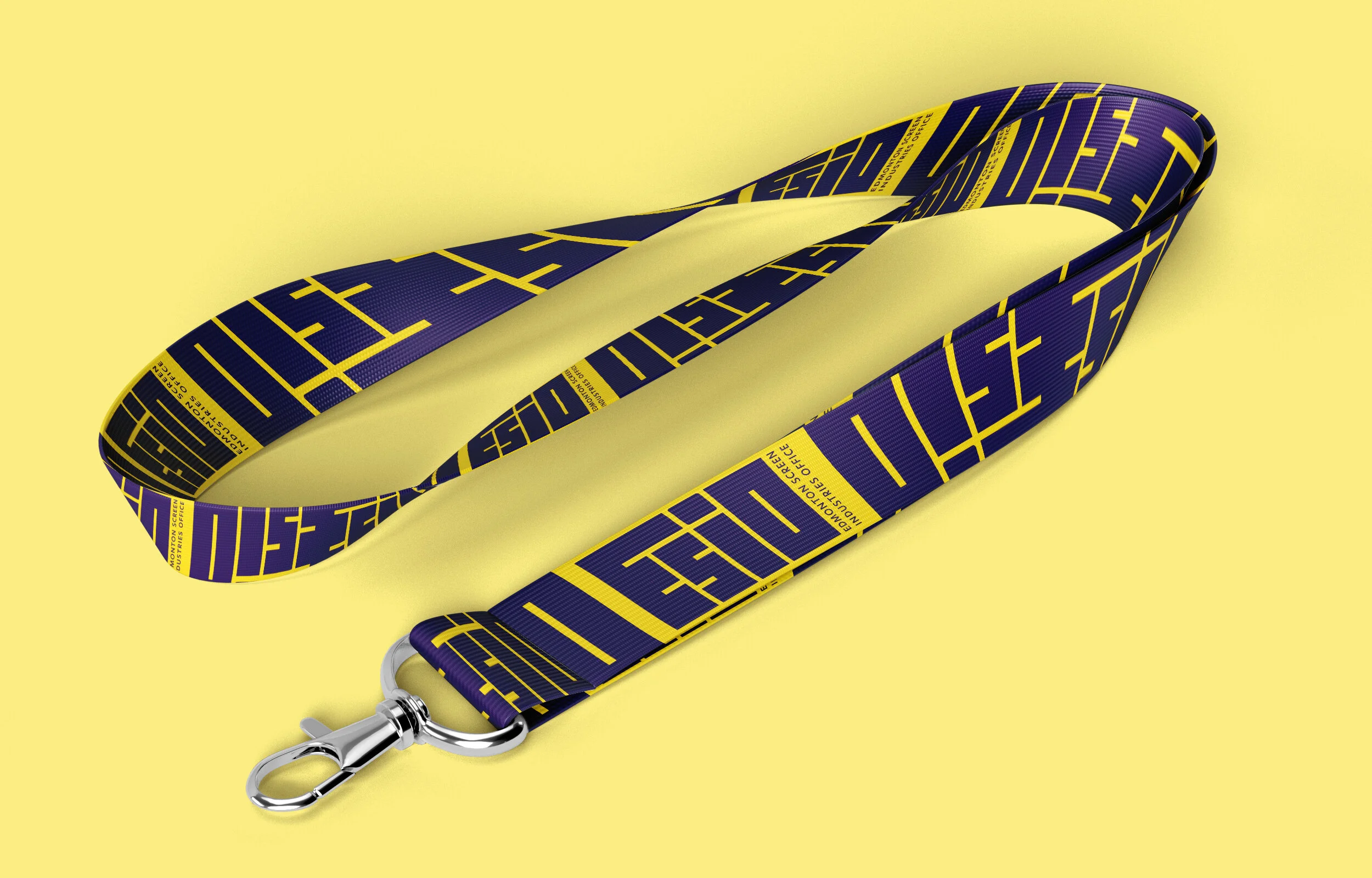
The ESIO logo is a nod to the screens that hold this world of possibilities. The blocky, rectangular letters that make up the logo reference the diversity of screens, all shapes and sizes, that creators use to bring their visions to life. And in its entirety, it uses a 16:9 aspect ratio – echoing one of the most familiar screens that people interact with.
It references some visual cues from an earlier era, while also drawing on something more future-focused. It represents multiple screens, multiple formats, multiple creators all converging to create the world of Edmonton-made screen media content. Like the screens it represents, it can also be used as a window, with scenes from Edmonton-made films, shows, games and experiences contained within the letters. Also using the purples that had been used within the brand previously, while adding vibrant and exciting additional colours to allow for flexibility when talking about the many programs that ESIO offers.